Junmei's confirmed collaboration with Coca-Cola includes themed tin packaging in more than one format. Because confidential project quantities and commercial terms are not included, this case concentrates on the packaging context and review points visible in the project record.
Project context
Coca-Cola's visual language relies on a highly recognizable red, white and heritage graphic system. Promotional metal packaging therefore needs a structure that supports strong brand recognition without reducing the legibility of key graphics around formed edges and closures.
Two packaging directions in the supplied material
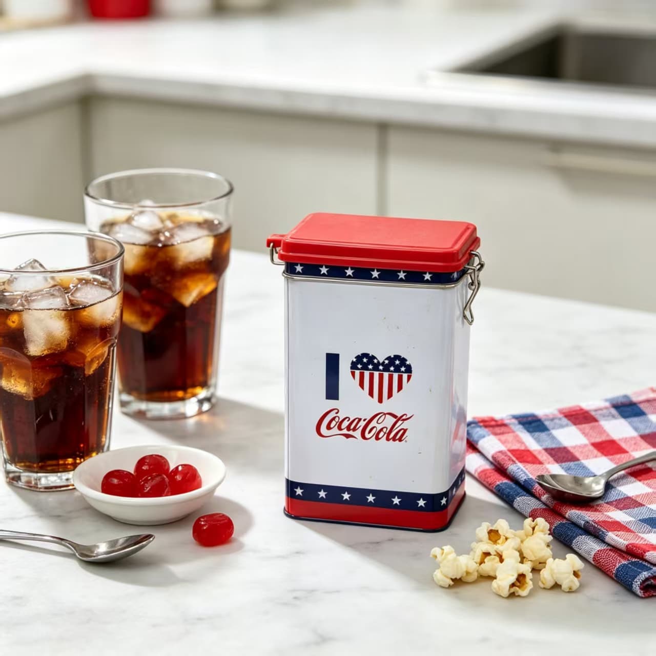
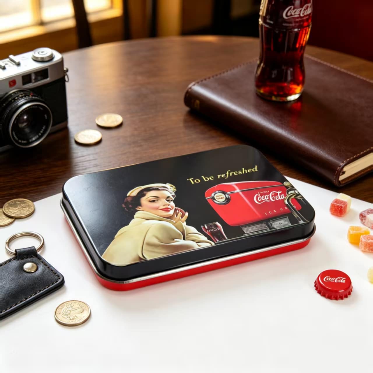
The tall canister creates a strong vertical display and practical storage function, while the flatter rectangular tin offers a broader storytelling surface. Both formats demonstrate how the same brand language can be adapted to different promotional uses.
- High-visibility front panel
- Reusable closure and storage function
- Heritage artwork organized around formed corners and lid edges
Review priorities for promotional tins
A buyer planning a similar program should confirm approved brand assets, print orientation, closure style, internal dimensions and the way the packed product will be presented. Vintage or detailed artwork also benefits from an early sampling and print review at the actual tin scale.
Buyer takeaway
Promotional tins work best when structure and campaign artwork are developed together. Starting with the end use—gift, storage, retail display or event distribution—helps narrow the right form before final artwork is released.