
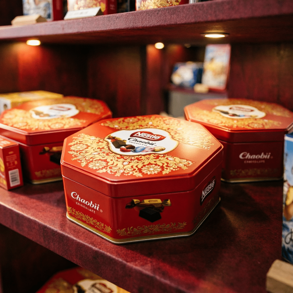
Junmei's confirmed collaboration with Nestlé includes a confectionery packaging direction with strong seasonal cues and a premium red-and-gold finish. No confidential sales or production figures are published; the case is presented as a visual and sourcing reference.
Project context
Seasonal confectionery packaging must create gift value while protecting the product presentation. The supplied visuals use a deep red base, gold decorative detail and a centered brand panel to create a premium shelf signal without relying on excessive copy.
Structure and visual hierarchy
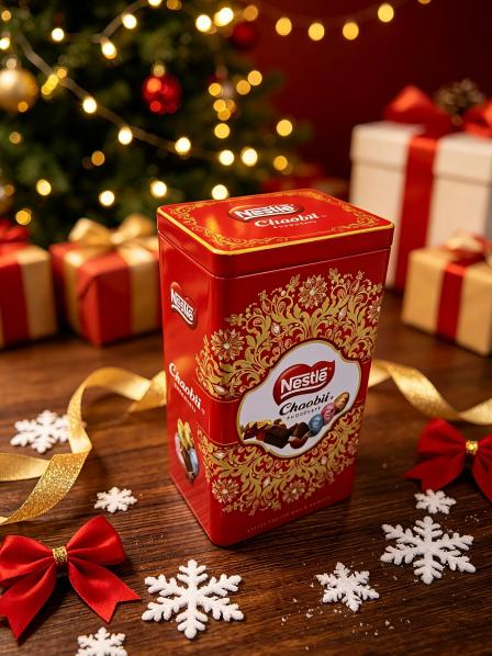
A faceted body introduces distinction from standard rectangular cookie tins, while the lid and front panels retain clear brand zones. The tall version creates a second presentation direction for gifting and display.
- Premium red-and-gold color system
- Clear central brand panel
- Reusable form suited to gifting and seasonal display
What food-packaging buyers should review
For a related confectionery project, the packed product, direct-contact method, inner tray or bag, coating requirement and destination-market documents should be defined before production. Decorative finishes and food-contact review are separate approval tracks and both need written confirmation.
Buyer takeaway
A seasonal tin can feel premium through disciplined color, structure and finish choices. Confirming the filling system early prevents the visual concept from moving ahead of the practical food-packaging requirements.