
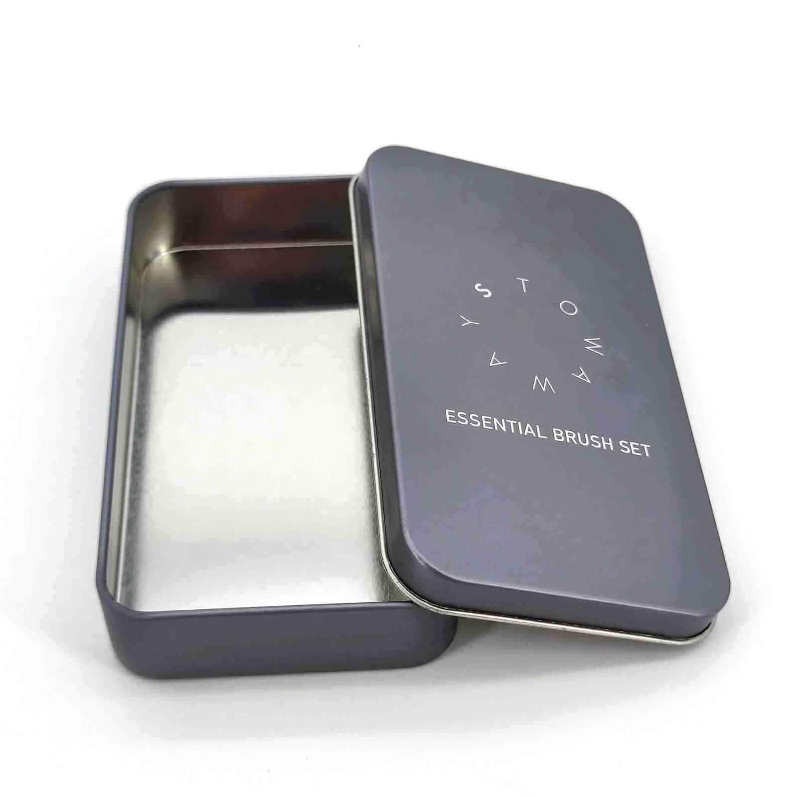
Choose a tin finish by the brand effect, artwork geometry, forming limits and the reference that will be used for approval. Embossing raises selected metal; debossing presses it inward. Matte, gloss and metallic directions change surface appearance rather than shape. These options can be combined, but every added interaction should be reviewed on the actual structure.
Compare the main effects
| Option | What it changes | Works well for | Main approval points |
|---|---|---|---|
| Embossing | Raises a defined area | Logos, borders, icons and tactile focal points | Height, edge definition, position, print registration and reverse-side effect |
| Debossing | Recesses a defined area | Subtle brand marks, panels and texture | Depth, geometry, readability and interaction with the lid or insert |
| Gloss finish | Produces a more reflective surface | Saturated graphics, photographic artwork and high-color impact | Reflection, scuff visibility and approved sample appearance |
| Matte finish | Reduces surface reflection | Premium, soft-looking graphics and restrained color systems | Color appearance, texture expectation and abrasion review |
| Metallic direction | Uses metallic ink/effect or visible metal in the design as agreed | Highlights, festive graphics and premium cues | Base metal, white undercoat, transparency, color target and proof method |
| Combined finish | Coordinates print and forming effects | Campaign packs and high-value gift tins | Layer order, registration, tooling feasibility, cost and sample approval |
The table describes design directions, not a universal technical specification. Final feasibility depends on the tinplate, component geometry, forming process, artwork and expected use.
Embossing: design for metal movement
Embossing uses matched tooling to move the metal and create a raised feature. Broad, clean shapes generally communicate more reliably than extremely fine lines or dense small text. The feature should sit far enough from rolled edges, seams, hinges, sharp draws and other formed areas to avoid conflict.
When print and embossing align, allow for industrial registration tolerance. A thin printed outline that must sit exactly on the edge of a raised logo is less forgiving than a design with intentional overlap. Junmei reviews the artwork, position and proposed effect before tooling and can recommend a more stable geometry without changing the brand intent.
Debossing: check both appearance and clearance
Debossing creates a recessed effect and can make a logo or panel feel integrated into the tin. The inward movement may affect internal clearance, lid nesting or an insert positioned directly below it. The reverse side of the component should therefore be considered along with the visible face.
Depth is not selected independently of material and geometry. Approve the physical result for legibility, edge quality, internal clearance and how the feature behaves after forming.
Matte, gloss and metallic appearance
Finish terms can be interpreted differently across brands, printers and substrates. Define the target with an agreed sample, color reference and written layer instruction. The same CMYK or Pantone reference can appear different over white coating, transparent ink or exposed metal, and a matte top surface may make a color look different from a gloss version.
Metallic-looking artwork can be created in more than one way. The right route depends on the desired color, whether the metal should remain visible and how the design must reproduce in production. Avoid approving a metallic effect from a monitor alone.
Junmei’s custom tin solutions cover printing, embossing, debossing, windows, handles, inserts and other project-specific components. The factory will confirm which combination is appropriate for the selected mold and production route.
Four checks before committing to a special finish
- Geometry: Is the effect clear of high-deformation areas, edges, seams and functional parts?
- Registration: How precisely must the printed and formed elements align, and does the design allow practical tolerance?
- Use: Will repeated opening, stacking, transport or retail handling expose the most sensitive area?
- Reference: Which proof, physical sample, color chip or retained sample controls mass-production approval?
The factory can conduct print appearance, lid-fit and project-specific abrasion or handling checks, but no finish should be described as absolutely scratch-proof. Agree on the test method and acceptance reference for the actual project.
Sample approval should lock the whole appearance
The physical sample should be reviewed under representative lighting and from the angle a buyer will see on shelf. Check:
- overall color and contrast;
- matte/gloss/metallic appearance;
- emboss or deboss location, height/depth and edge definition;
- alignment between print and forming;
- text and barcode legibility;
- visible marks caused by forming or assembly;
- lid fit and any internal interference;
- the agreed packing protection for decorated surfaces.
Record the approved file version and retain the agreed sample or color reference. The tin sample approval checklist can be used to document the decision before mass production.
Cost and schedule implications
Special effects may add tooling, prepress, sample and inspection work. Multiple artwork versions can also affect print planning and repeat-order control. Final MOQ and timing depend on size, structure, printing and tooling; Junmei’s starting point for custom production is MOQ from 3,000 pieces.
To evaluate an effect, send the tin size or reference, editable artwork, marked effect area, color target, order quantity and required date through the RFQ page. Junmei will review feasibility with its printing, tooling, forming and quality teams before the finish is locked.